Luna’s Next Top Model
Last time we ended off with a figure that will probably be in the paper I’m trying to write by the end of the summer. I’ve made an improved version of said figure and submitted it with my abstract for LunGradCon 2021, which was officially accepted today, so I figured we should go back and break it down from the start.
As a refresher — what I’ve been trying to do for the last four years is develop a way to quantify the difference in night-time temperature between impact melts and fragmental ejecta around young lunar craters, under the hypothesis that impact melts should be made of a layer of solid material with some amount of regolith developed over top. The regolith, being thin and fluffy (i.e. having a low thermal inertia), should initially cool off quickly, and then maintain a steady temperature once the thermal wave reaches the depth of the massive impact melt deposit underneath. Unfortunately, while this model sounds nice and simple, it can’t be what exists in reality. When you model impact melts with such a sharp-boundaried two-layered structure, this is what those surface temperatures look like:

As you can see, at basically all depths the surface temperatures remain very close to constant throughout the lunar night. While impact melts definitely remain warmer than other types of ejecta, we don’t see nearly such a dramatic distinction as this model would suggest. For example, here are night time temperatures from the on- and off-melt regions of the crater Korolev Z:

The ejecta areas plotted here against the melt are areas I tried to select to be the best possible comparisons in terms of their slope and rockiness, and yet although Korolev Z is quite a young crater (with a presumably thin cover of regolith on its impact melt) we see no evidence of the near-constant temperatures predicted by a simple two-layer thermal model.
I tried many ways to get around this problem, and in fact it would continue to plague me for several years until I conceded there was just no way to make a model like this fit the data. Similarly to the density structure for standard lunar regolith proposed in Vasavada et al. (2012) based on Diviner surface temperature data, I realized the transition from solid rock to regolith must be more gradual at impact melts as well, and that adequately capturing the nature of this transition would be essential in making any unified thermal model work. I experimented with several modifications to the Hayne et al. (2017) thermal model which would allow me to include densities in the rock-regolith transition, but all of them contained many additional parameters that were poorly constrained, especially those defining the relationship between density and thermal conductivity.
Then my colleague Jean-Pierre Williams hit on an idea: what if, instead of trying to force a dependence of the physical properties on density throughout the whole model, we simply picked a density for the bottom of the model, figured out the corresponding fraction of rock vs regolith, set the model bottom properties, and then scaled from the surface to the bottom values with the usual exponential H parameter? Whether or not this was strictly physically motivated, it would allow us to be consistent with previous models, and reduce the model parameter space to just two variables: ρ_d (the model bottom density) and H.
To show an example of what I mean:
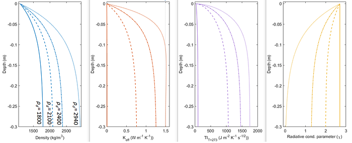
As the bottom density increases, we now get a range of profiles of thermal properties with depth, from the original one used in Hayne et al. (2017) on the far left (1800 kg/m³) to one approaching rock on the far right (2940 kg/m³). We had a lot of discussion about what to do about that final plot — the “radiative conductivity parameter” — as this controls the scaling of the radiative vs solid parts of the thermal conductivity, something that becomes especially important in the region beyond close-packed spheres typical of regolith models, but decided a simple linear scaling relationship with density was the easiest way to do it without introducing unnecessary and unverifiable complexity.
So now, back to those surface temperatures. How do we use this model to fit them? Which brings me to every geophysicist’s favourite topic:
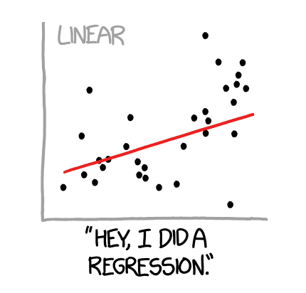
Regression analysis!
As a reminder: you’ve probably heard of linear least squares regression, that nice little method where we minimize the sum of the squared differences between a model and data in order to find parameters of the line that fits them best. If you’re reading this blog, there’s a high chance you’ve done it before yourself! Good job. Everyone pat themselves on the back.
However, what happens if our model is not a nice linear function of one (or more) parameters? Well, then my friends, we must tread into the deep, dark, shark-infested waters of non-linear regression.
While there are sometimes ways to transform non-linear model equations into linear forms suitable for linear least-squares, in general we have no such luck once things start getting big and complex. This is especially the case if, like me, you’re for some reason a huge masochist who wants to fit partial differential equations to your data for which no closed-form solution exists. In that case, you know what time it is: time to break out the numerical approximations!
I glossed over the details of this in the previous section, but it is no small feat to mathematically derive and then write a program that implements a numerical solution for such equations, but thankfully minds much smarter than mine have been thinking about such problems for centuries now. Within the field of planetary science, much work has gone into constructing models that solve the heat equation in various media and under different forcing conditions, so all that is left is to specify the particular equations your desired materials behave by and the boundary and initial conditions of your model. I ended up using a modified version of the Planetary Code Collection’s 1D thermal model for bodies in vacuum, developed by yet another Diviner member, Norbert Schörghofer. I needed to modify the numerical scheme to allow for materials with temperature-dependent thermal properties, and a host of small changes to improve the efficiency of the code in running many times on a limited number of processor cycles (i.e. my puny laptop). I also added features for performing slope and horizon modifications to the surface insolation boundary condition, but that will be a topic for another post.
With this code in hand, tweaked and tuned for performance, we’re finally ready to start fitting some data. Let’s get regressive, baby!
A first thing to note is that non-linear regression is actually just a single example of a group of mathematical problems known as optimization problems (also minimization problems, although the objective isn’t always to minimize the supplied function so the former is more applicable in general). You may have heard of these in the very chic-and-modern context of neural networks and deep learning, where they are also called gradient-descent methods. The main objective of such problems is to take a function of (many) variables, and find the values of those variables where the function takes on its minimum or maximum value (or more broadly, its optimum). We call this the optimal solution — in general, however, it is not guaranteed that such a solution exists.
Thankfully for most of modern science, a least-squares problem is guaranteed to have an optimal solution by its very construction: since we are minimizing the sum of the squares of the residuals between the model and data, these are just quadratic equations, i.e. parabolas. A nice thing about parabolas (or, in multiple dimensions, paraboloids) is that they are convex, meaning that they don’t have points where their second derivative changes sign. This means that, if we follow the first derivative till it reaches zero, we’re guaranteed to find the minimum of the function!
How does this help us in non-linear regression? Well, by specifying our function to minimize as the sum of the squared differences between model and data, we can simply take the first derivative (or gradient in higher-dimensional parameter space), take a small step in that direction, and keep going until we stop seeing a decrease in the function. Then we know we’ve for sure found the optimal solution, and thus the values of our model parameters that best fit the data — and this works even if our “function” contains some horrible-to-evaluate messy numerical solution of a PDE! Easy peasy, right?
Well… not so fast. We’ve left out one thing: while it is true that there is guaranteed to be a theoretical minimum of the least squares problem, the fact that we can’t represent our least-squares function analytically means that we might find ourselves caught in a “valley” instead of a “pit”, and end up running off to some “optimal” parameter values that are extremely unreasonable. To see what I mean visually, have a look at these two plots:
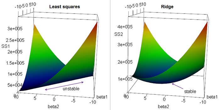
The one of the left is considered unstable because, if we didn’t have the nice smooth graph of the function and could only evaluate it numerically at a given point, there would be a huge number of points that are almost equal in their sum of squared residuals. The one on the right is much more amenable to numerical least-squares regression, because the minimum is surrounded by obviously higher values on all sides.
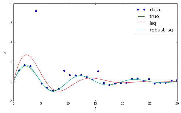
Back to the problem at hand: to actually perform this regression, I used the least_squares function in the package scipy.optimize. This allows a large amount of customization by the user in terms of specifying a residual function and passing parameters to it, specifying targets for termination, and choice of method in evaluating the least-squares function (or loss function, as they call it), as well as the form of said function. I dug through a bunch of the documentation, examples, and reference papers to understand the workings of the module, and then implemented it in a python script to evaluate my Fortran model on a set of surface temperature vs local time data for every pixel in a region. You can get an idea of what it’s doing by look at some test-runs of it fitting data:
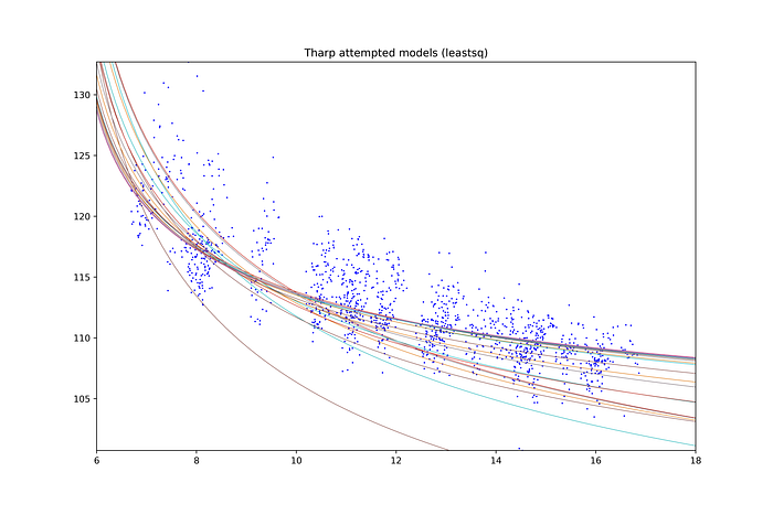
Each one of those curves represents a combination of the two parameters input to the model as mentioned above, and every time it then runs the model until it reaches equilibrium, calculates the differences between the model and the data at each local time, and then does its least-squares magic. You can see that it can start off seemingly way off-course (the curve that goes off the bottom of the graph), but the nature of least squares means it will eventually settle in towards the optimal values (the cluster of lines through the majority of the data).
So, that’s it! Perfect! Now all I had to do was run this code on all the surface temperature data at a given latitude-longitude coordinate, repeat for every pair of coordinates in a scene, and I’d have a map of the variation in the two input parameters that could be visualized easily! What could go wrong?
…Well, as you’ve probably guessed by now, there’s always more that can go wrong in science. And in the case of least-squares regression, one of the biggest boogeymen is outliers. These are those nasty little data points flying way off from the rest of your nice smooth curve, that have absolutely no business being so extreme and radical, and yet just one or two of these little buggers can ruin your whole regression. Because the least-squares function takes the square of the difference between the model and data, any points far away from the rest of your data can give you huge residual values and bias the final fitted curve. For example:
Looks terrible, right? But your optimization routine doesn’t know that. It doesn’t care. All it knows is that this is the very best it could do to make that quadratic function as small as possible dammit, and it would like to at least get a little credit around here sometimes. There there, least_squares. It’s okay.
The trick to fixing this is to find a function of the residuals that, frankly, does what you actually want it to do: make the difference between the function and the majority of points as small as possible. But since the quadratic form of the function is what we exploited to make sure we could find this minimum, what is there to do? Never fear: robust regression is here!
Robust regression chooses a different form for the loss function that is less sensitive to outliers. There are actually many options here, since all we require is that the form of the function is convex: for example, we could use the absolute value |f(x)| instead of the square of our residuals, and indeed this is sometimes used (denoted as the ℓ1 loss). A disadvantage of this is that the function is no longer smooth at the origin, meaning it doesn’t have a derivative (which we need for taking steps with our optimization algorithm). Thus a workaround is the use the soft-ℓ1 loss, which is a “smooth” approximation to the absolute value. Regardless of the choice, the improvement in the presence of outliers is clear:
With all these components in place, I was finally, finally ready to actually run my code on my data. Since the evaluation of the derivative in the optimization routine requires many function evaluations, each of which requires running a piece of code that has to solve a PDE many many times, I used the multiprocessing package in python to run it in parallel on all the data to make the compute time more manageable (coming soon: porting this to more powerful computers than just my laptop, and, maybe, even to a supercomputer!)
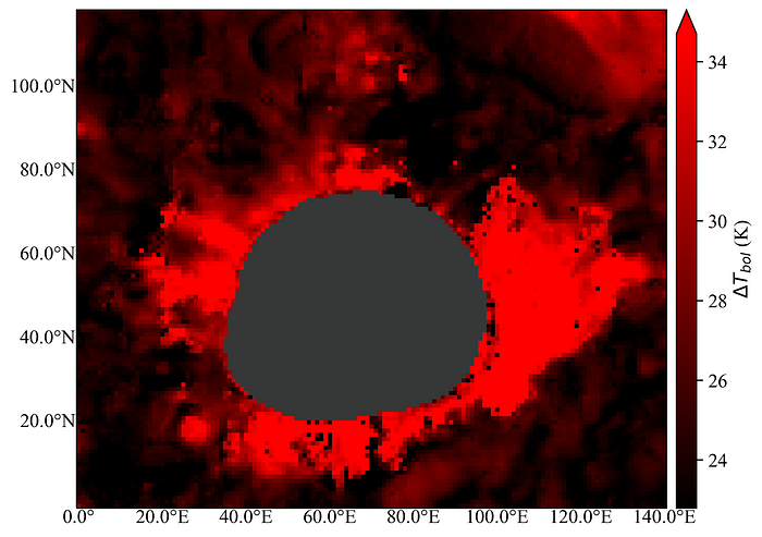
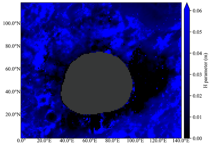
When finished, I had two arrays with optimal H and ρd values, and could plot these as channels of an RGB image. For the red channel, I plotted the difference in temperature between early in the lunar night and just before sunrise (small=stuff that stays nearly constant in temperature, large=stuff that either starts very hot and loses heat rapidly, or starts near typical temperatures and gets very cold). In green, I plotted the best-fit model-bottom thermal inertia (since this experiences a smaller range of values than ρd, and captures what we’re actually trying to understand better). Here, small values=low thermal inertia, aka fluffy material, and high values=high thermal inertia, aka something similar to rock. Finally, I plotted the best-fit H-parameter in blue, where low=fast transition from surface to bottom density (i.e. thin or non-existent regolith cover, in the case of H=0), and large=slow transition between top and bottom density (in the case of very old regolith, or impact melt with a large range between its pulverized, regolith-ified surface and the high density at depth).
As in the last post, the result is this:

This time, however, I’ve added markers to regions with various colours and pulled out their surface temperature vs local time data, to see how they compare in their cooling behaviour and thermal inertia profile with depth:
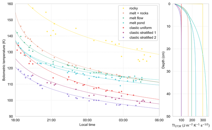
You can clearly see here that the impact melts “cross over” the other curves because of their rapid cooling in the early night and then subsequent maintenance of higher temperatures later on. This is because the low-thermal-inertia cover of regolith that builds up on their smooth surfaces can lose heat quickly, but below that is a substantial reservoir of heat stored in the massive deposit itself. There are also some interesting differences in clastic ejecta, that show the more traditional variation between low/zero H-parameter (red) associated with younger clastic materials to high H-parameter (purple) associated with fully pulverized, well-mixed, old regolith. And in yellow, we see what would traditionally be described as “rocky” terrain, where large boulders on the surface initially blast a massive amount of thermal IR into space, but because of their more exposed surface area eventually cool down quite substantially.
It’s also somewhat instructive to have a look at the values of the three parameters in the individual channels:
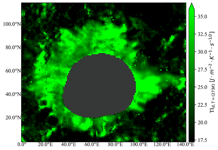
The thermal inertia (green) channel is especially interesting if you look at its range of values. Going back to the figure way back near the beginning where we discussed model variations with depth, you can see that the maximum values never even get close to those of “pure rock” (~36 J / m² ⋅ K ⋅ s^½ — oof, that typesetting — vs. ~1750 J / m² ⋅ K ⋅ s^½). What does this mean? Who knows! My hunch is that it’s indicative of the fact that thermal infrared can only sense as deep as the thermal skin depth, or the characteristic damping length of the thermal wave produced by periodic solar heating. On the Moon, this is somewhere between 4–20 cm, so anything buried deeper than that is effectively invisible to thermal IR. Thus, if an impact melt is buried by regolith thicker than this, we might just be seeing the very top of the transition region to the full density at depth, rather than the solid mass of the deposit itself.
Coming up, we’ll look at another thorny issue that’s the bane of planetary surface modellers everywhere: topographic correction. 💀
till next time,
xoxo gossip grad